
Madding, the author behind the amazing
Cards on Cards web blog (which should be a must read for any fans of the St. Louis Cardinals) has a regular weekly feature called “
Airbrushed Fridays”. That feature of his has really opened my eyes to Topps image altering. I had always suspected it as a kid, but I just couldn’t believe that it was possible for a company like Topps to do such a thing. They were the classiest, coolest, longest running and highest quality Card Company out there; I didn’t want to believe that they would fake pictures. I didn’t want to believe, I couldn’t believe that Topps would have someone doodle (poorly) on ball players caps. When I first stumbled upon Madding’s column, read it, and then perused his “Airbrushed” archives, my neighbors down the street could probably hear me scream “I knew it!”. I just really couldn’t believe that with all of the photographers and resources that Topps had, that they would do something this “bush league”. I mean even 35 years ago Topps had a stable of over 100 photographers, most who also worked for newspapers and magazines and were at EVERY SINGLE GAME with a camera in hand.

I just don’t see how getting a photograph of a guy with the appropriate team’s hat could even be an issue. I have never personally had the privilege to shoot cards for Topps, but I have freelanced for 5 other (formerly) major brands-Fleer, Donruss, Pinnacle/Score, TriStar and Upper Deck. In the past, when I got a “call” (actually an e-mail now, it used to be a fax) for a certain player, generally someone geographically near to me, I had the image in their office the next day.

Even in the 90’s, before digital cameras and emailing photos, with the assistance of a one-hour photo lab and FedEx, I still had the shot for the card company the next day. As big as Topps was (still is) I would imagine that they have a network of 100’s of photographers eager to shoot whatever they need. As a child who was interested in photography, my parents actually arranged a meeting for me with a Topps photographer-but that will be another story on another day.

. I will use some of the insight he provided for this story, though. He did tell me that he attended every single game of the season, he also worked for the Bridgeport (now Connecticut) Post newspaper and he said he provided Topps with about 5,000 images per year. He also said that they did in fact have around 100 photographers in their group. A little simple math will tell you that somewhere in the Topps’ offices there are at least half a million images of baseball players begging to become cards.

Back then Topps only had one release each year and it never used more than 800 images. It seems like they had a whole lot of options available and it makes the quality of images hard to swallow. I think that it takes (took) a whole lot more time and energy for someone with zero artistic ability to attempt to scribble a logo on someone’s airbrushed ball cap than to just take another picture, but what do I know? Topps obviously had different logic than I, a simple card collector and blogger, and those ideas of theirs produced 100’s (if not more) god-awful, ugly, hideous and downright foolish cards of great ballplayers with horrible looking logos scrawled on their hats.

Of course in doing this, it has given us bloggers plenty of writing fodder, right? Now, I am going to steal an idea and try something new for me, so bear with me. I have nowhere near the writing or layout talent, the expertise, the readers or the humor that my friend Madding does, but I am not going to let that stop me from stealing his idea.
Madding,

I apologize in advance for idea theft and stepping on your toes, but here is a tribute post to your fantastic idea. It aint Friday today, but I present to you, the “
Collective Troll’s Mangled Monday, A Look at the Mess that Topps Made of the 1974 Traded Set.”

This is the smallest (in quantity) traded set that I know of, it has just 44 cards in it and each card shares the same number as the regular issue card, just with a T after the number. When I first started here I had the full set, but I helped a few of you out to finish your own sets and I am down to just 40 cards. Right now I am missing the checklist, Bob Locker, Larry Gura and the 1974 Cy Young Award Winner Mike Marshall (since the set is already broken, I will consider trades for all of these cards).

I am going to point out some statistics, but I will base them solely on the 40 cards in my possession. The numbers are frightening, you have been warned… Now the ’74 Traded Set was Topps first attempt of the decade at an update set, so I suppose that they deserve a little bit of leeway, but not really. The way I see it, if you don’t have a single decent looking card, why bother putting together a set, right? One method that Topps used to avoid the airbrush was to use photos of players without their ball caps on, men without hats if you will.

Baseball players are not models, they aren’t pretty people and some guys look downright scary without a hat on,

especially this close up. Now the regular issue set was not without it its own hatless atrocities, case in point card #116 of Pirates hurler (and apparent Albino) Jerry Reuss,

but in the base set it was the exception and not the rule. In the traded set, out of these 40 cards, we have 9 hideous, hatless freaks.

That is 23 %. Staggering. Their other trick is: “Hey, is that a spaceship up there?” or “Check out that blonde on the roof!”.

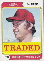
Yeah, as a photographer you say some weird stuff, but apparently they wanted images of guys wearing hats with their heads tilted back far enough that the logo isn’t visible. It is really a scary thing for a player when the shutterbug tells you to lean back and look up, it is another way of telling you that you probably want to rent this year. There were a few guys who had the “look up” pose in the base set, perhaps guys who were on the block. Red Sox pitcher Dick Drago

got that treatment with his card, #113, in the base set, but he wasn’t actually traded until spring training in 1976. Had he been traded in ’74, Topps probably would have used the same photo and only needed a tiny bit of paint. Juan Marichal is the only Hall of Famer represented in the ’74 Traded set (out of 40 that is 3%) and he had a very cool looking card in the base set (#330)
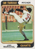
which showed his trademark delivery and gigantic leg kick, but on his traded card he gets the “hey, look up over there” treatment. No airbrushing required (apparently), they just covered the Giants logo on his jersey up with the “TRADED” bar and bam, they have a card.

It does give collectors a nice look at his impressive muttonchops, but still… I will say that I do like the “back of the card” on these.

The date and trade write-up is pretty neat, but for some reason its hilarious to me that Topps brings up the no-hitter that Marichal threw 12 seasons prior-is that pertinent info? Anyway, Topps used this photographic strategy with Marichal and 12 others making it 33% of the set looking up and off in the distance. This saved Topps from having to draw logos, but in some cases they did have to paint the caps and they are also delivering a set with 1/3 of the players “looking up” at God knows what. I wasn’t a card consumer in ’74 and I did go back as an adult and probably spent a whole bunch more money buying this set recently than it cost 35 years ago, that’s my fault for being a blind collector. Seriously though, this pose is ridiculous and it makes up 1/3 of the freaking set! After this mess was anyone surprised back then that Topps didn’t make a traded set the following year?

They did return with a 54 card set in ’76 and although they did put a hat on everyone, about half of those hats were airbrushed, so they didn’t really learn their lesson at all. If only Fleer and Donruss had entered the game a few years earlier, they could have kept Topps honest… Anyway, with the “men without hats” and the guys “gazing up in the air” we have more than ½ of the cards covered. So were all of the rest of them cool action photos? No. There isn’t a single game-action or even simulated action shot in the whole set. The other half of the cards are ALL PAINTED MESSES!

They had a few ‘brushed cards in the base set, but again, it was the exception and not the rule.

The rule is in the traded series that every single player (all 40 cards) who is wearing a hat isn’t actually wearing a hat that looks the image shows. They were all faked, all airbrushed, wool was (attempted) to be pulled over our eyes.

As a consumer this angers me, but I feel for the players, too. I mean its bad enough that these guys got traded, but Topps adds insult to injury with this awful pictures.
This is BS Topps! I don’t really have anything witty to say about these airbrushed absurdities, so just view and enjoy (or become ill). I would love to find the Topps executive that thought this would be a great idea way back when. I would be even more interested to find the man (or infant) who was responsible for the drawing the logos. There are a whole bunch of questions I would like to ask them.

I don’t have a ton of traded sets,

but this one, the ’76.
’81, ’86, ’87 and 1991 sets are what I have to go by.

1976 was a slight improvement in that they put hats on everyone, but every set up until 1991 still feature airbrushing, horrible photography and men without hats.

Here are a couple of cards from the 1991 Topps Traded Set that show that they did eventually get it right and it is in fact possible.

Thanks for reading, I love this hobby! Don’t forget to enter the Collective Troll’s Most Iconic (baseball)
Rookie Card of the 1980’s Contest!!! For more awesome airbrushed ridiculousness, be sure to check out
Cards on Cards on every Friday! Troll out.
 Madding, the author behind the amazing Cards on Cards web blog (which should be a must read for any fans of the St. Louis Cardinals) has a regular weekly feature called “Airbrushed Fridays”. That feature of his has really opened my eyes to Topps image altering. I had always suspected it as a kid, but I just couldn’t believe that it was possible for a company like Topps to do such a thing. They were the classiest, coolest, longest running and highest quality Card Company out there; I didn’t want to believe that they would fake pictures. I didn’t want to believe, I couldn’t believe that Topps would have someone doodle (poorly) on ball players caps. When I first stumbled upon Madding’s column, read it, and then perused his “Airbrushed” archives, my neighbors down the street could probably hear me scream “I knew it!”. I just really couldn’t believe that with all of the photographers and resources that Topps had, that they would do something this “bush league”. I mean even 35 years ago Topps had a stable of over 100 photographers, most who also worked for newspapers and magazines and were at EVERY SINGLE GAME with a camera in hand.


1974 Traded set? Topps was doing this long before that - at least as early as 1967.
ReplyDeleteIn some cases, "AIRbrushing" would be a misnomer. It looked more like some schmoe at Topps sat down with a jar of Testors model paint and a small brush, and just started dabbing paint onto the photo!
Jim from Downingtown
(Topps '66, '67, '68 blogs)
You sent me the Marshall Traded card, but I have it already. I'd be happy to return it to you if you need it for the set.
ReplyDeleteYa know, now that you pointed out how amazingly lame the 1974 traded set actually is, I have fallen in love with it.
ReplyDeleteThe other thing about that set is the word TRADED is so loud and humiliating. Yellow and Red. Caution and Stop. Danger and Wrong. It is if they are screaming LOSER at the poor traded player, then drawing what amounts to a dunce cap upon their head.
Ken, Its so bad, its cool, thats why I spent an afternoon posting about it...I do love the write-ups on the back, but the fronts are AWFUL! I agree with your observation about the "Danger: Loser Ahead" warning
ReplyDelete